The Problem
The development team at ShapeUp had a functioning B2B product that was seeing low engagement amongst users. The web based platform had several areas of inconsistency in the UI/UX, conflicting design styles, and a lack of a visual hierarchy. This caused users to have no clear direction of what to do after signing up.
Another problem was that users were experiencing difficulty consistently tracking data, as the tracking tool existed in multiple formats and locations within the product. Also, the challenge creation tool was rarely used and did not offer much flexibility in creating personalized challenges.
Users & Audience
The target users of the ShapeUp product are young to middle-aged professionals. The users primarily access the platform while at work on a desktop computer. Most users are interested in improving their health through exercise and weight management.
Team & Role
I led the redesign of the ShapeUp dashboard from concept to front-end development. Working alongside a product manager, I translated product requirements into wireframes, mockups, and HTML/CSS templates.
Design Process
The development team at ShapeUp had a functioning B2B product that was seeing low engagement amongst users. The web based platform had several areas of inconsistency in the UI/UX, conflicting design styles, and a lack of a visual hierarchy. This caused users to have no clear direction of what to do after signing up.
Another problem was that users were experiencing difficulty consistently tracking data, as the tracking tool existed in multiple formats and locations within the product. Also, the challenge creation tool was rarely used and did not offer much flexibility in creating personalized challenges.
Outcome
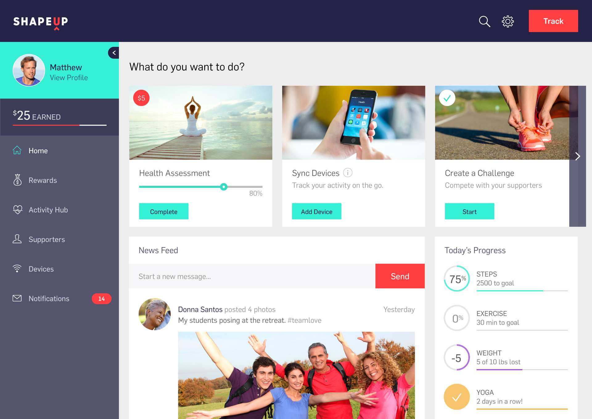
The redesigned dashboard offers a clear direction for next steps. Users can view progress of their most important metrics as well as track data from any page of the platform via a slide-out tracking tool that is accessed from the header. The new challenge creation tool offers a seamless way of creating new unique challenges with coworkers through a step-by-step wizard.
The project provided a foundation for future page redesigns and feature development.


